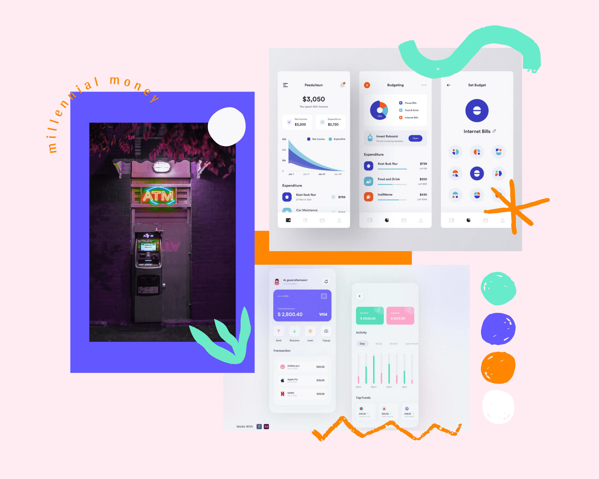
ui design Millennial Money
Overview
Millennial Money is a budgeting application designed for, obviously, millennials. This app wants to help you get smarter about how you earn, spend and save money.
This was a conceptual project, inspired from the CNBC Make It Youtube show called “Millennial Money”.
Solution
This was one of my first design projects and I tried so many iterations before coming with this final result.
I wanted to stick to the CNBC brand’s feel and colors - which are bright purple and bright green.
I was born in 1996, so labelled as a “millennial”. Even though our generation is known as the one who’ll spend more money on avocado toast than any other generation, some of the millennials are also frugal, start saving money and think about retirement from an early age. Just like I do 😁 ✌🏻.
My role
I worked alone on this project, so I was the UI designer, I came up with the concept, and also did the prototype part of the design process.
Time
This project took me 2 weeks to bring it to the form it is now. I worked on it in September of 2020.
Goal
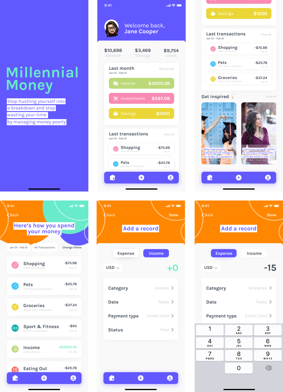
My goal was to design a budgeting application for millennials, that is not just showing you where your money is going, but also helps you understand how important it is to think about investments and savings.
So I created a section on the dashboard page where the CNBC Make It’s articles are shown, so that every user can also read the latest financial news to stay in the loop.
Moodboard
Before I start with a new design, I like to create a moodboard for the project I’m working on. Sometimes starring at a white artboard in Figma blocks my thoughts, that’s why creating a moodboard is easier for me to start on a project.
Dribbble is my go to website for this kind of thing and I visit it every day just to keep up with the new trends, but also because it inspires me so much. I usually like and save the things I find interesting so that I can use them in my moodboard for next projects - like this one.
After I find some designs and components that are similar to the ones I want to develop, I like to create a moodboard to inspire me just in case I get stuck or I can’t find my inspiration anymore. There are great tools for creating moodboards, but I use Canva everytime because it has such a nice collection of templates and is so easy to use for everyone.
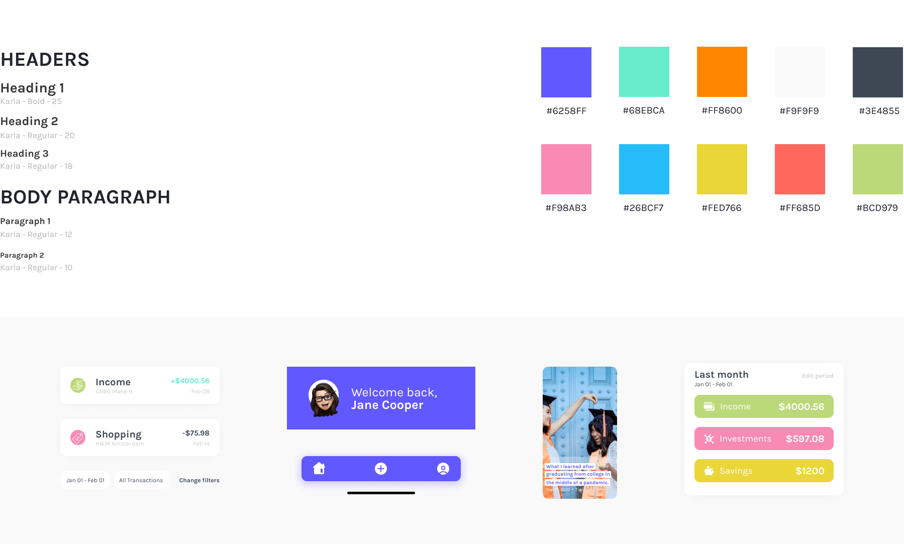
Style Guide
I wanted to keep the CNBC Make It brand’s colors, so I needed to make a homey and modern design integrating purple and bright green. I introduced another color - orange and used a very light gray as the background color. I also used another five secondary colors in order to give the design a fintech feel, but also a playful and modern one.
High fidelity prototype
All screens
Conclusion
I decided to keep this little UI design project short. As much as I love personal finance and CNBC’s show, I didn’t want to dive too deep into the project. I think the next step for this will be to focus more on the UX part of the project and later create a full case study on it.
Now the app is working like this: user tracks his spendings and earnings manually into the app, but in the future I want to change this; I think it will be much better for the user to have the platform synced with his bank account so he can have more time to look through the reports and change his spending habits.
It was really fun to work on this project and hope I will get back to it soon to improve some things here and there. Now I’m seeing it as a UI design challenge, but later on I might feel the need to do a whole case study about it.