case study plantassy
Overview
plantassy is an e-commerce iOS application that helps you find the plants that fit your lifestyle best.
This was a conceptual project, as I wanted to practice my UI Design skills and dive more into the UX Research process.
Solution
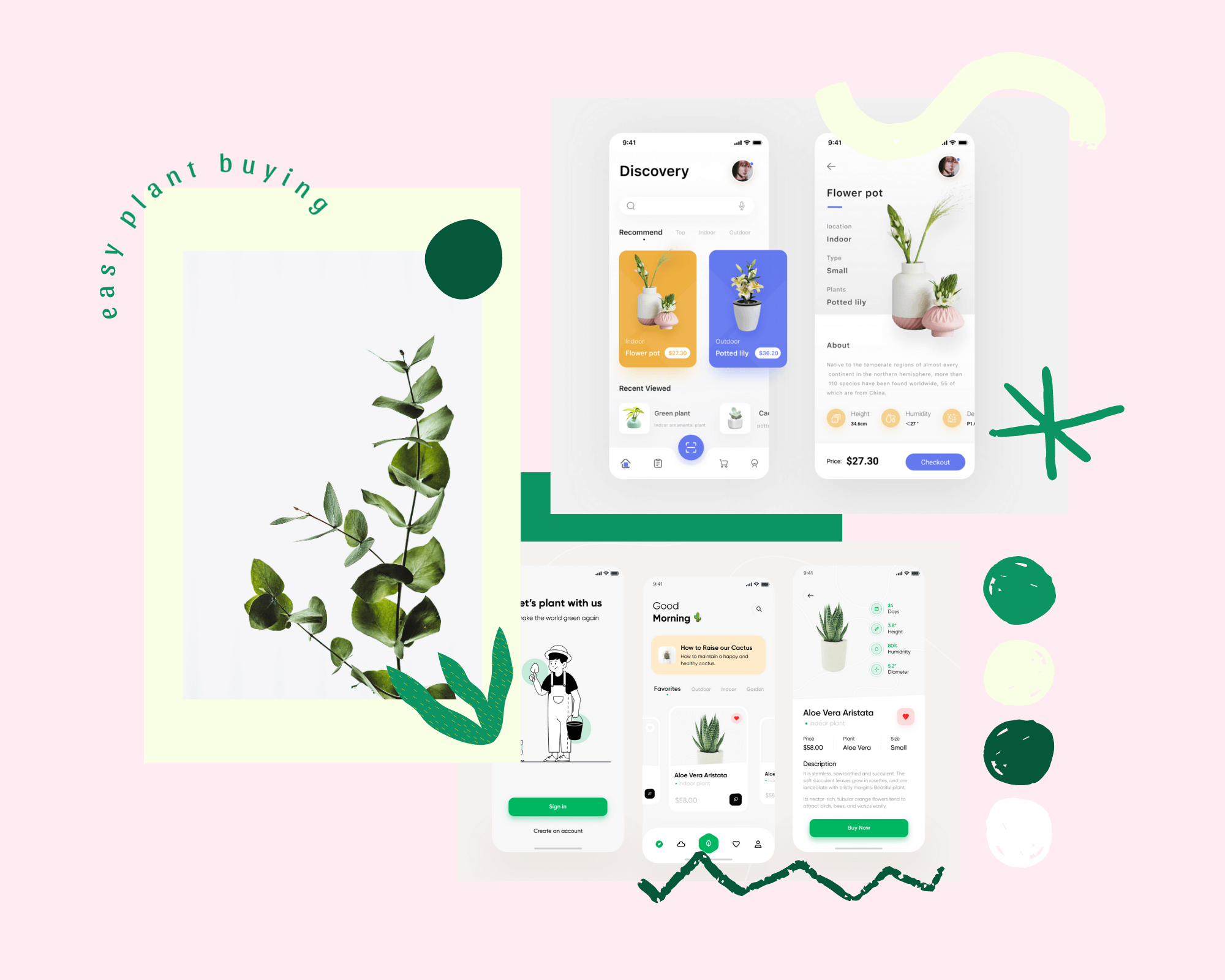
After many design iterations, I came up with a solution that represents a familiar, homey and clean design.
This project was an exploration on how plant buying can become easier if you acknowledge your lifestyle.
plantassy works based on the pre-entered user’s lifestyle and proficency in taking care of plants. This way, you waste less time on reading more than 5 articles on how to take care of that fussy plant and you buy plants that you know you can take care of without falling in love with a plant that you don’t have time for.
My role
Because I worked alone on this project, I acted as the UX researcher, I came up with the concept, been the UI/UX designer and also did the prototype part of the design process.
Time
This project took me 6 weeks to bring it to the final form (as it is now). I worked on it from the beginning of June 2020.
Problem
You’ve probably noticed that plants have become the new black in the past few years and plant Instagrammers are a thing now (as I am one of them haha), but still not everyone knows exactly what taking care of a plant actually means.
Because of how the social media portays plants - cacti that bloom every year, Bird Of Paradise as being the most frequently used plant by the minimalist interior designers and so so much more unrealistic stuff, plant hoarding was romanticized so much that now people feel the pressure of buying all kind of plants just to not feel missed out of the trend.
Goal
My main goal was to design an e-commerce application for plant buying that allows you to filter the products that fit your lifestyle, but at the same time to discover new ones based on your experience.
No need for hoarding every plant you find in the store, just buy what suits you best ☺️.
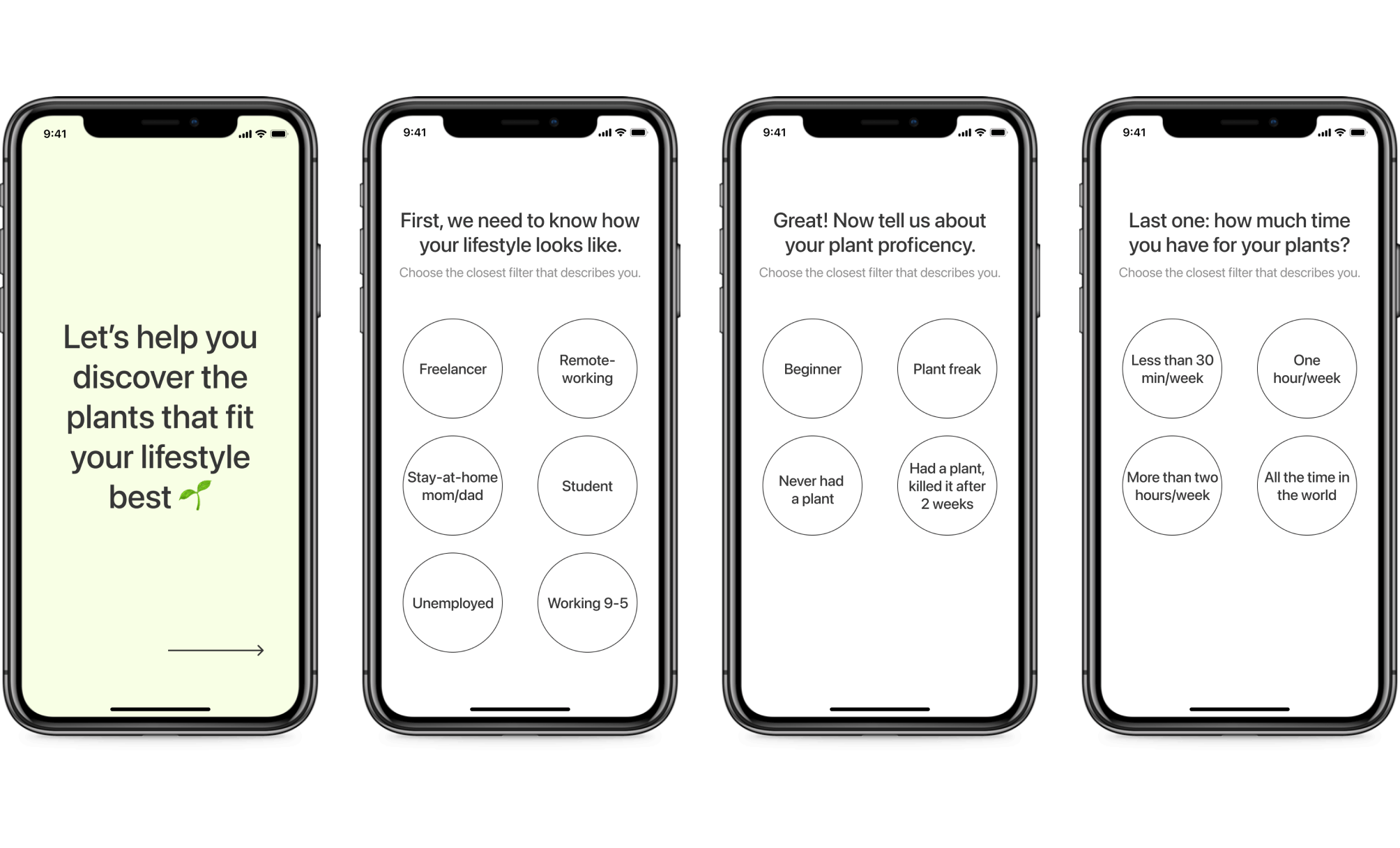
More about the filters
When it was time to create the filters for the onboarding page, I did it with my plant experience in mind. So my main focus was on the time one has to take care of the plants, the lifestyle she/he has and the proficency in taking care of a plant.
This is how I came up with these filters:
- 👩🏻💻: freelancer, remote-working, stay-at-home mom/dad, student, unemployed, workin 9-5;
- 🕐: less than 30 min/week, one hour/week, more than two hours/week, all the time in the world;
- 🌱: beginner, plant freak, never had a plant, had a plant and killed it after 2 weeks.
User research
I wanted to learn more about how people decide to buy a plant (either online or in a phisical store). My focus was on:
- 1. Do they know that the plant they chose is proper for their lifestyle?
- 2. Do they buy plants just for showing off on social media?
- 3. What do they look after in a plant?
In order to find my answers, I conducted an online survey that was completed by 20 people. Normally, I would have also done some in-person interviews, but you know how the situation was in the world in June 2020.
While I know that the in-person interviews allow me to go deeper into the user’s behaviours, the survey was also a great idea for gathering more information that I didn’t think about it untill then.
What I discovered after this was crucial for my project:
😢People don’t acually think about their lifestyle when they choose to buy a plant (the majority don’t even read the care instructions);
📱People buy plants based on what they see on social media. Some of the plants are considered “rare plants” and the moment they find them in store they feel like they’ve accomplished something other people can’t;
🥇People tend to like big plants better because they look much prettier in photos and this give them the feeling of having a house full of plants or a “jungle house”.
So after gaining all this information, I was able to develop Ana Johnson, my user persona, a 26 year old freelance interior designer working in San Francisco.
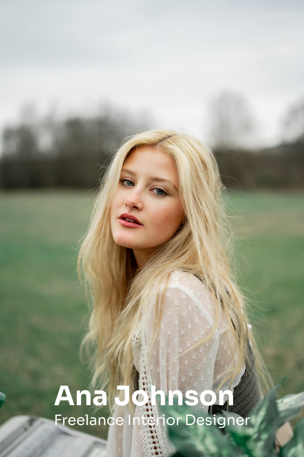
Ana is a freelance interior designer from London, working and living in San Francisco for about 3 years. She is a plant lover and because she spends a lot of time on Instagram and Pinterest, she is always up to date to the new plant trends. She finds that her conversations with her loved ones always end up about plants and about taking care of them and ofter she learns new tips and tricks from others.
About
- 😀 26 years old
- 📍 San Francisco, CA
- ❤️ Engaged, without kids
Goals
- • Grow an indoor jungle
- • Find more plants that fit her lifestyle at the moment rather than just easy-to-take-care-of plants she finds in the stores
Pain points
- • Doesn't have enough time to go offline plant shopping
- • Hard to find rare plants
- • Most of the plant apps that she is using don’t have the UI that she likes
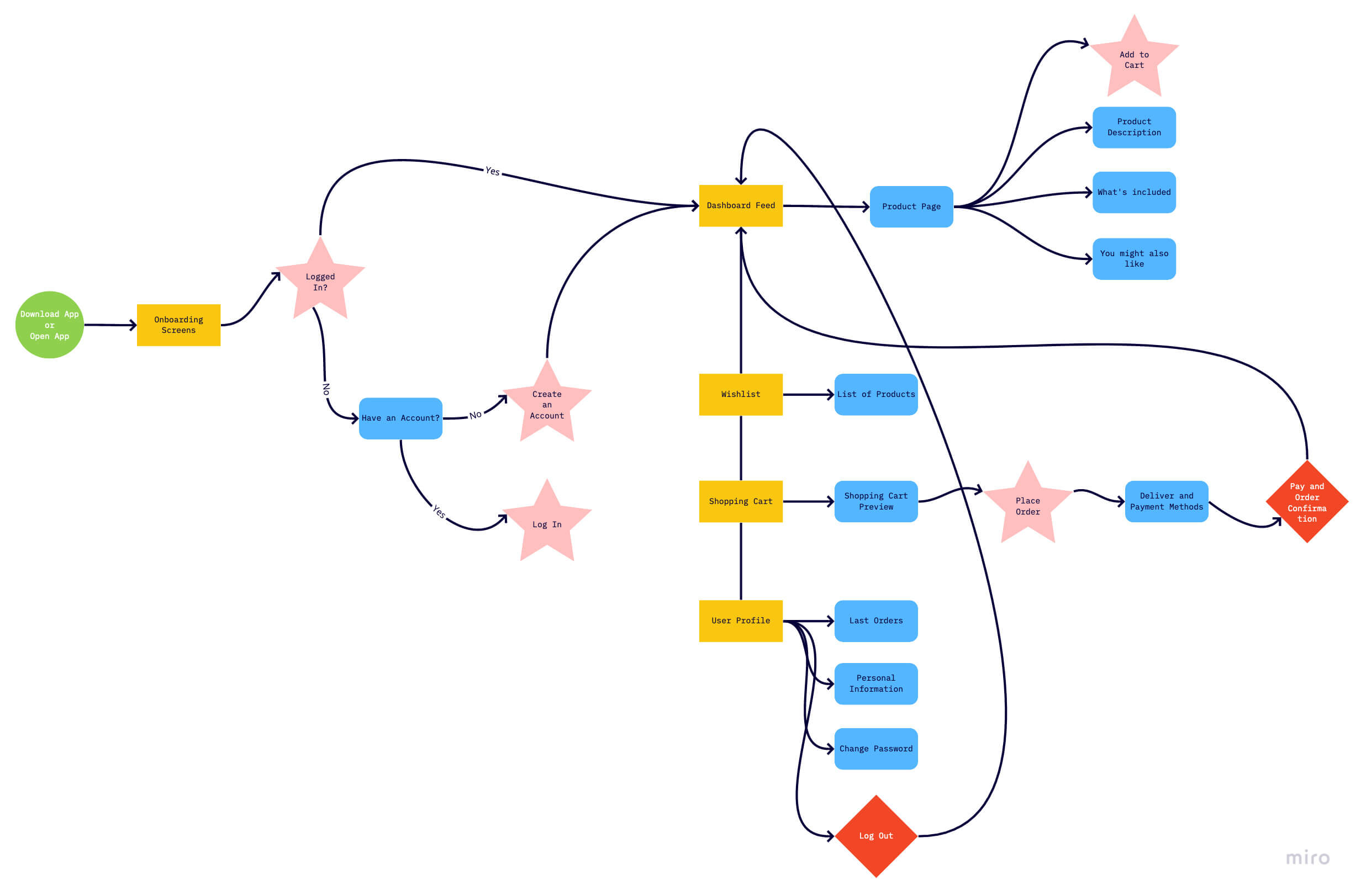
Information architecture and user flow
After developing my user persona, it was time to map out the information architecture. This helped me organize the content better and showed me how many interactions it'll take in order to complete a task.
I also developed a user flow that allows for seamless and cohesive user experience. Given that user may be looking for some plants in particular or be inspired while browsing the pre-made list of plants for their lifestyle, the users have the flexibility to choose from a variety of plant collections made for their own lifestyle.
Ideation
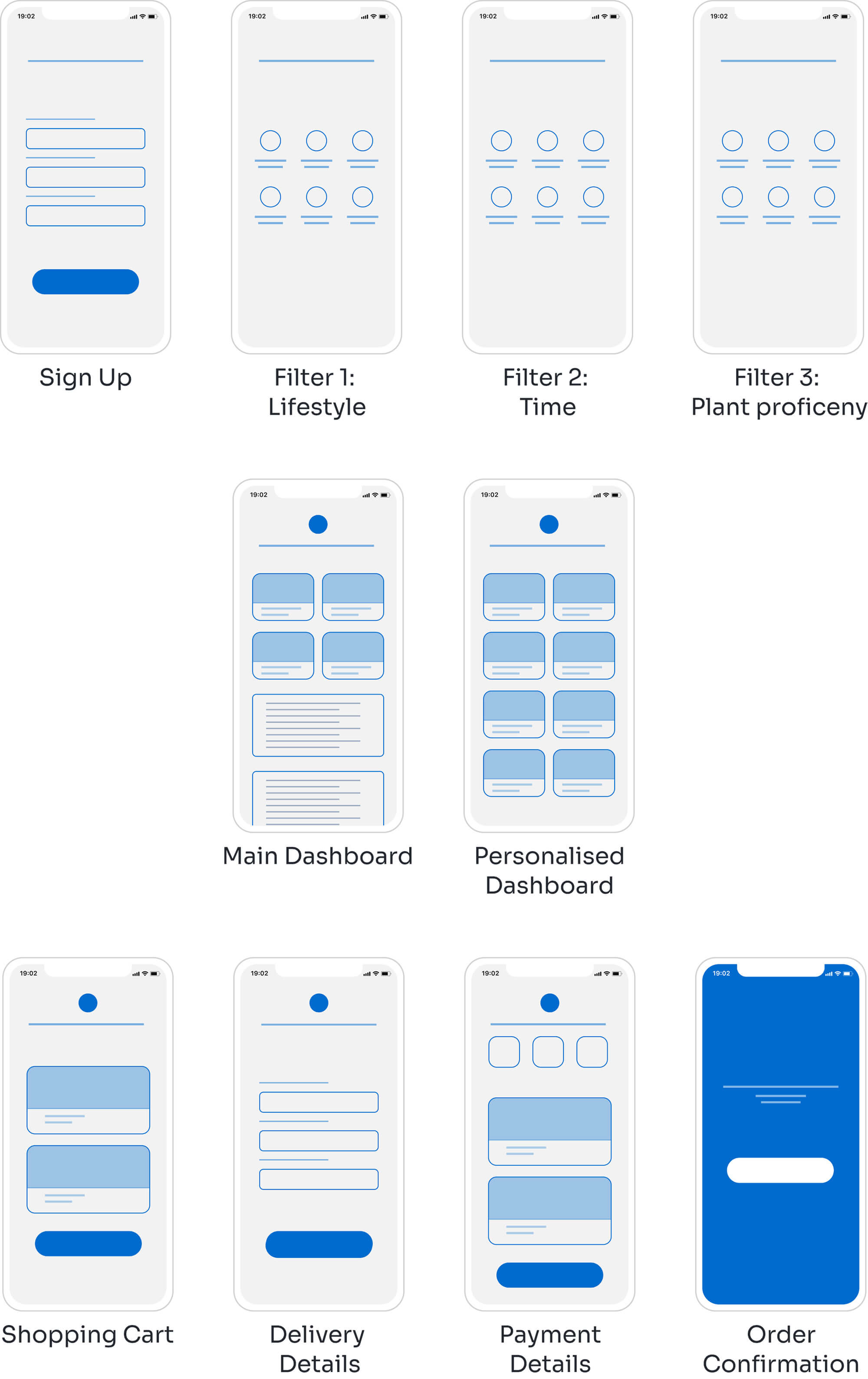
With all the information I have gathered by now, it was time to start creating the wireframes.
At first, I created a set of low-fidelity wireframes of all of the key screens: onboarding page with filters, user dashboard with recommendations for their lifestyle and check-out page.
Usability testing
I conducted the user testing on the low-fidelity wireframes to see how users would complete certain tasks. I did this with one thing in mind: I was curious if they need to scroll or tap on certain screens. My main goal was to identify pain points and improve them in the future design. The tasks I tested for:
- 1. Filtering the user based on his lifestyle and plant proficency
- 2. Creating recommendation of plants based on the filters;
- 3. Adding the products in the cart and check out.
At first, I created a set of low-fidelity wireframes of all of the key screens: onboarding page with filters, user dashboard with recommendations for their lifestyle and check-out page.
Moodboard
Before I start with a new design, I like to create a moodboard for the project I’m working on. Sometimes starring at a white artboard in Figma blocks my thoughts, that’s why creating a moodboard is easier for me to start on a project. Going online and finding inspiration work created by other designers became my hobby lately. Dribbble is my go to website for this kind of thing and I visit it every day just to keep up with the new trends, but also because it inspires me so much. I usually like and save the things I find interesting so that I can use them in my moodboard for next projects - like this one.
After I find some designs and components that are similar to the ones I want to develop, I like to create a moodboard to inspire me just in case I get stuck or I can’t find my inspiration anymore. There are great tools for creating moodboards, but I use Canva everytime because it has such a nice collection of templates and is so easy to use for everyone.
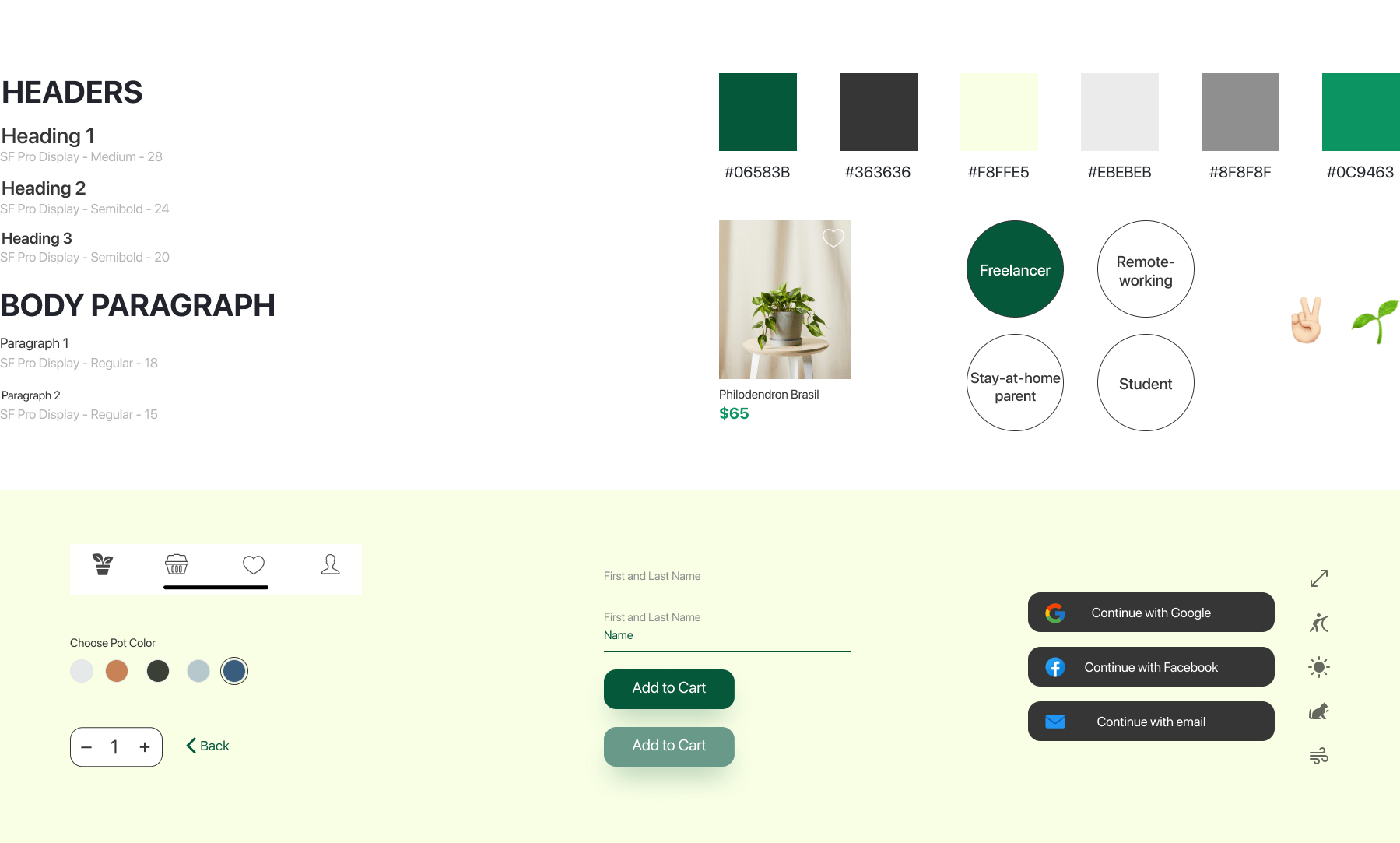
Style Guide
After changing my wireframes according to the feedback I got and creating my moodboard, it was time to proceed with the visual design. Because this is a conceptual project, I could choose the colors myself and the typeface of the brand also. I wanted to create a friendly color palette and went for dark green and pale green with hints of light gray and white to create a more friendly aesthetic design.
High fidelity prototype
Conclusion
Because this is a conceptual project, I can’t measure how profitable it could be.
Creating this mobile app all by myself from scratch was a big and tricky project. I used the experience I got from my marketing field for the UX Research part and at the same time I improved my UI Design skills. It was challenging to keep track with everything at first, but after gaining more feedback, the project started to become more and more alive and I stayed focused on the big picture rather than losing myself in the minor things.
Overall this was a very interesting challenge to be involved in and I hope I can make such great projects like these in the future. The next step would be to design a website for this brand as well.